|
 |
|
 |
|
Graphic Design Portfolio
 |
|
T-shirt Designs
Hundreds of T-shirt sales through
several sites boasting Wave of the Future custom designs from our graphic
artists:
See for yourself how we can create custom designs for your
business, club, or activity for print on demand sites like
Cafe Press, or your local embroidery or
t-shirt shop! |
 |
|
Gamewardens of Vietnam 2008 Reunion
This Vietnam
Veterans organization has commissioned Wave of the Future's design services for
many specialty graphics, tee shirt designs, and more! View their online store
at: http://www.cafepress.com/vetstuff
|
 |
|
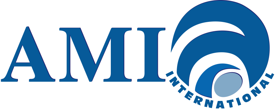
AMI International #1
AMI International was looking
for a fresh look for their logo – one that would work well on clothing
items as well as online and for print media. The first offers sea and sand
colors with the traditional anchor and conservative fonts. |
 |
|
AMI International #2
Still using a traditional serif
font, but mixed with a stylized earth symbol and san serif font for
"International" - kind of a mix of old and new. |
 |
|
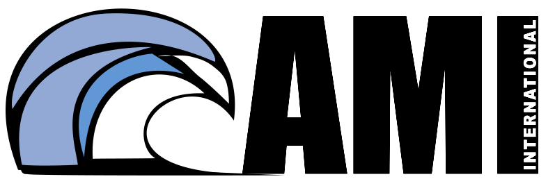
AMI International #3
The boldest of the four - I know
you don't say the "American" in AMI anymore, but when the wave started taking
the shape of an eagle, I just went with it! ;-) |
 |
|
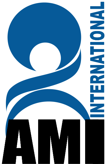
AMI International #4
Probably the best of the four
designs for embroidery purposes -- a simple two-color design with few small
lines. |
 |
|
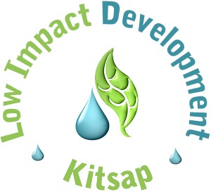
Low Impact Development (LID) of Kitsap County
The
Low Impact Development project will join others across the country in
developing community and builder awareness of low impact building and
development practices in order to lesson the impact of wastewater on our
nation's waterways. Wave of the Future and
Raincross Technologies is working
in concert to product an interactive
site design that allows
team members and staff to share and update documents, monitor deadlines and
tasks and promote general awareness. |
 |
|
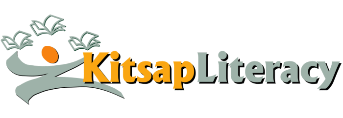
Literacy Council of Kitsap County
Wave of the
Future is designing custom graphics for the Literacy Council to use on t-shirt
and accessory sales through Cafe Press to assist in fundraising and community
awareness. We're also assisting in their
site redesign. |
 |
|
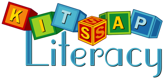
Literacy Council of Kitsap County
Wave of the
Future is designing custom graphics for the Literacy Council to use on t-shirt
and accessory sales through Cafe Press to assist in fundraising and community
awareness. We're also assisting in their
site redesign. |
 |
|
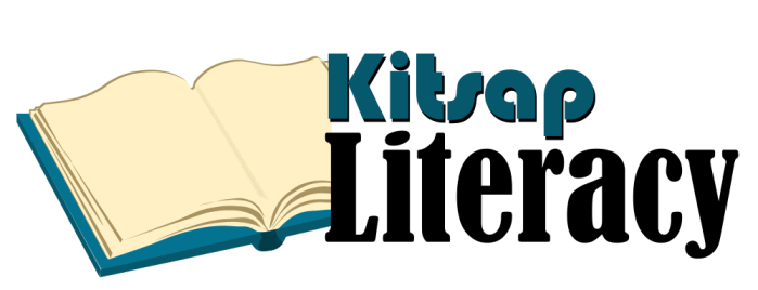
Literacy Council of Kitsap County
Wave of the
Future is designing custom graphics for the Literacy Council to use on t-shirt
and accessory sales through Cafe Press to assist in fundraising and community
awareness. We're also assisting in their
site redesign. |
 |
|
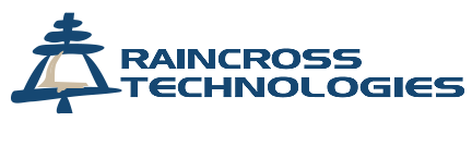
Raincross Technologies
Raincross Tech of
Riverside, CA. was looking to soften their appearance and pull-away from the
hard-edged technology look a bit. Wave of the Future created a softer look to
the distinctive mission bell design that fit well with their new
site design. |
 |
|
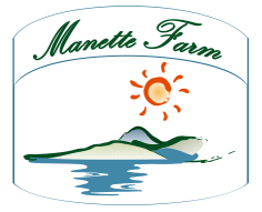
Manette Farm
A small urban farm, Manette Farm
wanted a professional looking logo that imparted a "fresh from the earth" look
and feel. The owner wanted to incorporate the beauty of the location in the
design, with the warm sun looking down on the gentle hills of the Manette
peninsula that overlooks the beautiful Sinclair Inlet in Western Washington.
The logo design was deliberately kept simple, so that it would easily resize
for all of the many label sizes. |
 |
|
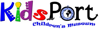
KidsPort Children's Museum
This new Kitsap County
museum for children was looking for a "fun" look that imparted the quest for
knowledge that is so much a part of what they offer to the area children. The
logo uses bold primary colors with a fun flair that incorporate ideals such as
searching the world (in the O of Port), and the Idea Bulb atop the I in
Kids. |
 |
|
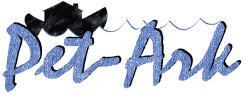
Pet-Ark
Pet-Ark is a portal to databases
maintained by pet rescue and humane societies across the US. The logo imparts
the core of the company's mission, which is; Pet Rescue, by using the Ark in
the background. Wave of the Future is also providing custom graphics for all of
the nationwide web sites. |
 |
|
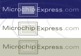
Microchip Express
Microchip Express is an online
tracking service for pet owners and pet professionals. Its database allows
owners to keep their pet's information completely up-to-date — which
in-turn enables veterinarians and humane societies to return pets to the owners
in record time. Wave of the Future provided the look and feel for the
new site graphics - as well as this custom
logo. The logo design is quite simple, with the
site name place in front of a graphic representation of a chip. |
 |
|
SeaDak Solutions — Product Logo
SeaDak needed
a more professional look once they started marketing their product nationwide.
Wave of the Future designed a complete package, including: CD Labels,
PowerPoint Templates, Logos for products and company, and a new
website. |
 |
|
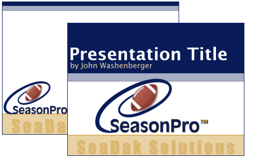
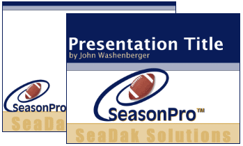
SeaDak Solutions — Custom PowerPoint™
Templates
SeaDak needed a more professional look once they started
marketing their product nationwide. Wave of the Future designed a complete
package, including: CD Labels, PowerPoint Templates, Logos for products and
company, and a new website. |
 |
|
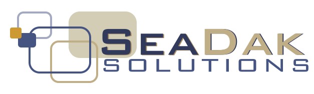
SeaDak Solutions — Company Logo
SeaDak needed
a more professional look once they started marketing their product nationwide.
Wave of the Future designed a complete package, including: CD Labels,
PowerPoint Templates, Logos for products and company, and a new
website. |
 |
|
SeaDak Solutions — EdWin™ Product
Logo
SeaDak needed a more professional look once they started marketing
their product nationwide. Wave of the Future designed a complete package,
including: CD Labels, PowerPoint Templates, Logos for products and company, and
a new website. |
 |
|
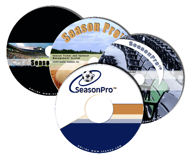
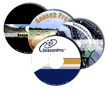
SeaDak Solutions — Product CD Labels
SeaDak
needed a more professional look once they started marketing their product
nationwide. Wave of the Future designed a complete package, including: CD
Labels, PowerPoint Templates, Logos for products and company, and a new
website. |
 |
|
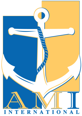
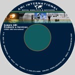
AMI International Promotional CD
AMI International
Naval Analysts had Wave of the Future design a label for their promotional CDs
that they use to give previews of products and services typically locked away
in a secure area of their main server. The dramatic colors of the design sets
their CD apart from those of their competitors and the ample memory of a CD
allows them to pack their presentation with audio, video, photos, and more.
They have recently asked that we design a PowerPoint presentation and
AuthorWare module that takes their customers through the promotional CD in a
more entertaining - and interactive - manner. |
 |
|
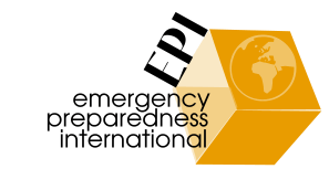
Emergency Preparedness International #1
This first
proposed logo design uses a box shape to indicate that EPI has all of your
emergency preparedness needs in one convenient place. This shape is easily
recognized down to even the smallest resolutions (for business cards, etc) The
Earth-symbol strengthens the international — or worldwide —aspect of
your business. The colors (varying shades of orange with black) are in keeping
with the safety yellow and black color scheme you chose, while maintaining a
certain "print-ability" not found with a true yellow. Bold, black font for the
initials — EPI —symbolize strength and stability, while the actual
name behind the initials is spelled out below. The unusual arrangement of the
shapes found on this logo will naturally draw the visitor's eye, no matter
where on the page (or print material) it is placed |
 |
|
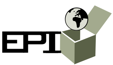
Emergency Preparedness International #2
This
second proposed logo design uses a box shape and Earth-symbol for the reasons
listed above. The colors (varying shades of green with black) are considered
soothing, earth-friendly, colors that also show high on usability testing as
trustworthy, lending an air of permanence to the brand. The arrangement of the
shapes found on this logo are a bit less subtle than the others with the
overriding theme being "everything you could possibly need in one neat
package". Bold, black font for the initials — EPI —symbolize strength
and stability, but on this logo, the company name is not included — making
it better suited for smaller-sized uses, such as; embroidery, business cards,
letterhead, etc. |
 |
|
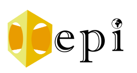
Emergency Preparedness International #3
This third
proposed logo design uses a box shape to indicate that EPI has all of your
emergency preparedness needs in one convenient place, but with circular shapes
on the sides to symbolize input from many different sources. This will still be
recognizable as the "one neat package", while alowing a little Yin - or softer
side - to our symbology. This softer look is followed through with a softer
font-style as well. The Earth-symbol is more subtle in this design - appearing
above the "i". The colors are as mentioned in design #1. |
 |
|
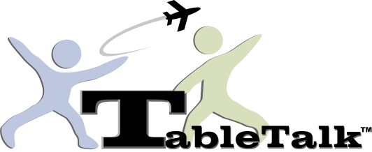
Table Talk
A series of 15 minute flight
instruction modules for Certified Flight Instructors (CFI) to use as ground
school prior to each flight. Logo centers around a stylized "T" that serves as
the table, with the instructor (blue - solid - aviator) explaining a flight
standard (the whoosh representing speed, the plane - aviation) to the student
(green - novice). |
 |
|
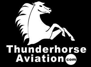
Thunderhorse Aviation
Thunderhorse Aviation
produces computer based training modules for private and commercial pilot
ground school. The rearing stallion is reminiscent of the blackhorse aviation
logo used by the US Army—a symbol recognized by aviators worldwide. The
logo and colors are branded throughout all of the Thunderhorse CBT products and
website. |
 |
|
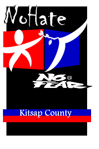
The Kitsap County Human Rights project
The No Hate,
No Fear logo was designed to appeal to the teen-to-twenty-something crowd and
intended for use on decals, print literature, and clothing appliques. The
mission of the project is to lessen hate-based violence and promote
acceptance.
The bold coloring and simple lines lend themselves to all of
these uses with a slight variation required for the smaller projects, such as
business cards, envelopes and letterhead. The human form, could represent any
race or sex, reaching out—bridging the gap—to grasp the olive branch
offered by the bird. The bird and olive branch was chosen for its renown as the
symbol of peace—a symbol embraced by many religions and societies. The
words "No Hate" at the top of the logo are done in a font-face named Chiller.
This font was chosen for it's similarity to spray paint—embraced by youth
as a way of expressing their beliefs to the world at-large. The No Fear logo is
in no-way altered to ensure that there was no violation of the
permission-for-limited-use agreement with the No Fear company. The Kitsap
County name appears emblazoned on two rectangular images that symbolize
equality. |
 |
|
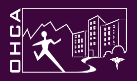
Olympic Health Care Alliance
OHCA was formed as a
consolidated recruiting force for the medical organizations on the Kitsap and
Olympic peninsulas. Their focus is to bring the positive aspects of living and
working in the area to the forefront for a select group of people (medical and
allied health). Wave of the Future created a logo that conveys a person happily
following their path to a health care related job (hospital buildings in
background, caduceus in foreground) in the Northwest (Olympic mountain range).
The logo is a simple two-color design that easily translates to
print. |
 |
|
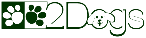
2Dogs Pet Supply
This online pet supply store will
target owners of the "pet who has everything", offering hand-made pet wear,
custom leashes & collars, etc. The store is targeted to dog lovers, so
we've gone for a soft, "cute" approach that welcomes lovers of cuddly animals.
The entire look-and-feel of the web site will mimic the soft & cuddly
approach used in the logo. Demographic studies of target shoppers and
case-studies of failed dot-coms were used in the development of this logo and
will be applied site-wide. Base color of the logo will change to match the
environment of each page of the site—appearing green for leashes &
collars, blue for treats, etc.—in accordance with color studies and
buying-trigger analysis. |
 |
|
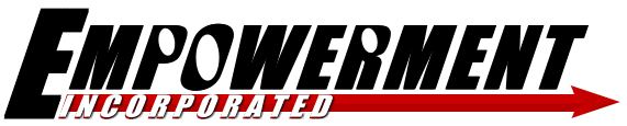
Empowerment Incorporated
This logo was designed
specifically for the Security-consultant portion of Empowerment Inc. We felt
that this side of the business called for a strong, "yang" look and feel.
Empowerment's security consultation experts work with military contractors and
corporations worldwide to provide realistic terrorist
risk-assessments.
The
logo was created with minor changes to a standard sans-serif font face to make
it unique and subliminally put the viewer's focus on the "Power" in
Empowerment. A 3D effect applied to the arrow represents forward motion. The
word "Incorporated" has been spelled out below and a contrasting color and
raised look has been applied with red, white, and black layers (all power
colors—symbolizing the company's ability to halt terrorist activities).
The word Incorporated, itself has been moved down below so that it gets
approprate billing on the logo—but doesn't detract from the powerful
company name. |
 |
|
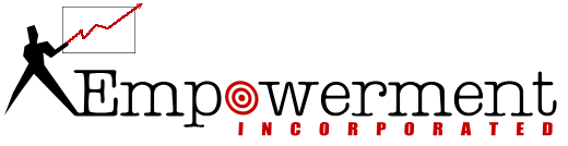
Empowerment Incorporated
This logo was designed for
the other side of Empowerment, Inc—the Instructional division—that
teaches sales and marketing professionals and instructors how to put together
memorable, targeted, Microsoft Power Point presentations. Empowerment felt that
too many business professionals had been taken "off task" by getting wrapped-up
in the technical side of putting together a presentation, so the focus of the
business is a "back to basics" approach—getting presenters back to the
basics of sales and successfully getting their ideas across to their
audience.
When
designing the logo, we chose to use a serif font face for the word
"Empowerment" to represent more of a business-like look and feel than the first
logo. The word "Incorporated" was spelled out below to allow people to know
that the company is incorporated, but not to lessen the appearance of the word
"Empowerment". The target symbol that replaces the O in empowerment represents
the company's ability to get the client back on target with their
presentations. The red accents, symbolize the "power" in the company name. The
man & the chart on the top-left side of the logo underscore the company's
mission, and symbolize the awesome power that will be put into the client's
hands (the red line on the chart doubles as a lightening
symbol). |
 |
|
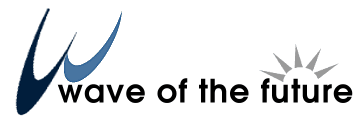
Wave of the Future The new Wave logo incorporates a
bold, blue "W" symbolic of ocean waves that ties in the popular saying... "It's
the wave of the future" (the basis for our company name) that is used by people
in-general to describe a product or service that will define the future or a
new way of doing things. The sun peeking above the word "future" in our company
name symbolizes the company's dedication to remaining on the forefront of the
technologies embraced by our clients—always looking towards the
future. |
 |
|
West Sound Today The WST logo was created to symbolize a
source of information rising from the West Sound region, with the word "Today"
symbolizing fresh, new information. When online, the magazine will focus on
events and destinations in Kitsap and Jefferson counties, with input from local
artists, writers, and businesses. |
|
|